Understanding the Elevation Data Behind Python Hills; a semi-technical overview.
If you've ever unfolded an Ordnance Survey map on a windswept summit, you'll know that the contour lines and shading do a remarkable job of capturing the shape of the land. What's less obvious is that the same kind of terrain data is freely available to anyone — and with a bit of Python you can turn it into your own basic hillwalking map images.
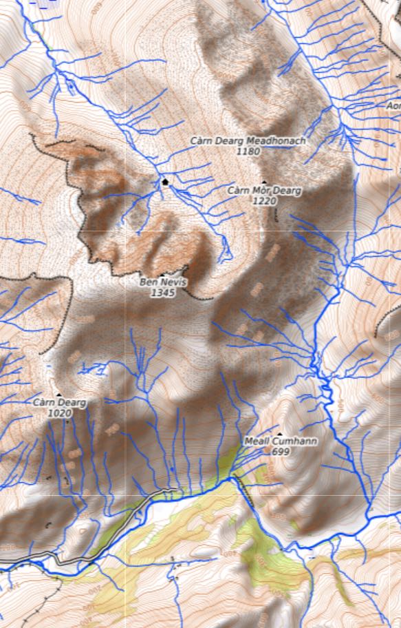
Python Hills is a small open-source project that does exactly that. Give it a list of mountains and it will download satellite elevation data, stitch it together, and render a shaded relief image for every peak — complete with labelled nearby summits. The entire pipeline runs from the command line with no paid software or GIS experience required.
In this post we'll briefly look at where that data comes from, how it's stored, and how a few Python scripts turn it into the topographic map images you see. No GIS or software degree required — just a curiosity about what's happening under the hood.
There is a link to the source code which has a much more detailed description further down this post.
A Brief History of Weather Forecasting Technology
Long before we could visualise terrain from space, people were trying to understand and predict what the atmosphere would do next. The story of weather forecasting is a gradual accumulation of observation, theory, and technology — and the mountains have always been at the heart of it.
Weather Balloons and Ships: The First Networks
By the mid-nineteenth century, meteorologists understood that weather systems travelled — a storm over the Atlantic today might reach Britain tomorrow. The challenge was gathering enough observations quickly enough to track them. The electric telegraph, introduced in the 1840s, allowed weather data from multiple stations to be centralised for the first time. Synoptic charts — maps showing pressure, wind, and temperature across a region at a single moment — became possible.
At sea, merchant and naval ships logged barometric pressure, wind direction, and sea temperature as part of their routine duties. The Royal Navy had kept systematic weather records since the 1850s, and by the turn of the twentieth century an international network of marine observations was feeding into national weather services. In mountainous regions, observers at high-altitude stations — including Ben Nevis, which had a manned summit observatory from 1883 to 1904 — provided invaluable data on how conditions changed with elevation.
The weather balloon emerged as a tool in the 1890s. Carrying simple instruments aloft, these unmanned balloons revealed that temperature, pressure, and wind changed dramatically with altitude in ways ground stations could never capture. By the early 1900s, the concept of the radiosonde — a balloon-borne instrument package transmitting readings by radio — was taking shape, and with it came our first real understanding of the upper atmosphere.
The First World War: Forecasting Under Pressure
The First World War transformed meteorology from a scientific curiosity into a military necessity. Artillery fire was acutely sensitive to wind speed and direction at altitude — a shell fired six miles will drift significantly in a crosswind, and the difference between a direct hit and a near-miss could depend on an accurate upper-air forecast. All major armies rapidly expanded their meteorological services.
The British Army's meteorological sections used networks of kite stations and pilot balloons to measure winds at altitude, and the data was used to calculate firing corrections in real time. Gas warfare introduced an additional urgency: a cloud of chlorine or mustard gas released upwind would be lethal to the enemy, but catastrophic to your own troops if the wind shifted unexpectedly. Accurate short-range forecasting quite literally saved lives.
Out of this wartime pressure came better observing networks, more rigorous data-sharing between allies, and — critically — the first serious mathematical attempts to describe atmospheric motion. The Norwegian meteorologist Vilhelm Bjerknes and his colleagues, working in Bergen, developed the concept of fronts: boundaries between air masses of different temperature and humidity. The polar front theory, published around 1920, gave forecasters a conceptual framework that still underpins much of how we think about mid-latitude weather.
The Second World War: Computing the Forecast
By 1939, weather forecasting had become a sophisticated operational discipline, but it was still largely empirical — experienced forecasters pattern-matched against historical observations rather than solving equations. The Second World War demanded both scale and precision that tested this approach to its limits.
The D-Day landings on 6 June 1944 stand as the most consequential weather forecast in history. Eisenhower's meteorological team, led by Group Captain James Stagg, had to identify a narrow window of acceptable conditions in the teeth of an unsettled early summer. The original date, 5 June, was abandoned when Stagg identified a developing Atlantic storm. His forecast of a brief improvement on the 6th — disputed by American meteorologists right up to the eve of the operation — proved correct. The decision to go, and to trust the forecast, changed the course of the war.
The war also accelerated computing. Lewis Fry Richardson had published a mathematical scheme for numerical weather prediction as early as 1922, but his calculations required an army of human computers and took months — useless for operational forecasting. The invention of the electronic computer changed this calculus entirely. In 1950, using one of the world's first computers (ENIAC), John von Neumann and Jule Charney ran the first successful numerical weather prediction, solving simplified atmospheric equations to produce a 24-hour forecast over North America. It was slow, crude, and covered a small area — but it worked. The era of modern numerical weather prediction had begun.
From Post-War to Digital: Closing the Gap
Through the 1950s and 60s, computers grew faster and weather models grew more complex. National meteorological services — including the UK Met Office, founded in its modern form in 1854 — began transitioning from hand-drawn charts to computer-generated guidance. Satellites added a new dimension in the early 1960s: the TIROS-1 satellite, launched in 1960, returned the first television images of cloud patterns from space, and within a decade polar-orbiting satellites were providing daily global coverage of cloud and eventually temperature profiles.
By the 1980s, the global observing system — radiosondes, aircraft reports, ship observations, buoys, and satellites — was feeding into global numerical models running on supercomputers. The European Centre for Medium-Range Weather Forecasts (ECMWF), established in 1975, pushed the frontier of forecast skill out to ten days and beyond. The Met Office's own models, now running on machines far beyond anything Richardson could have imagined, began to capture the fine detail of orographic effects — the way mountains force air upward, drive rainfall, and create localised wind phenomena.
For mountain walkers, this trajectory matters. The Ben Nevis summit observatory that closed in 1904 could not have imagined a world where a smartphone on that same summit would pull a 72-hour forecast generated by a global model resolving features just a few kilometres across. The chain from a ship's barometer in the mid-Atlantic to the wind speed on your summit card runs through more than a century of hard-won scientific and technological progress.
A Brief History of Digital Terrain Mapping
The idea of representing the Earth's surface as a grid of numbers is older than you might think. The roots go back to the 1950s and 60s, when the US military and photogrammetrists began experimenting with computer-processed elevation grids for artillery line-of-sight calculations and terrain analysis. The data was painstakingly derived from overlapping aerial photographs, and the computers that processed it filled entire rooms.
The Satellite Era
Everything changed in the 1970s when NASA and the US Geological Survey began capturing terrain data from space. The Landsat programme, launched in 1972, gave scientists their first continuous satellite view of the Earth's surface. While Landsat was primarily optical imagery, it proved that global-scale remote sensing was feasible and kicked off decades of investment in Earth observation.
Through the 1980s and 90s, elevation data remained patchy and inconsistent. Different countries maintained their own surveys at different resolutions and accuracies, and much of it was restricted or expensive. The dream of a single, consistent global elevation dataset seemed a long way off.
SRTM: The Mission That Mapped the World
That changed dramatically in February 2000 when the Space Shuttle Endeavour flew the Shuttle Radar Topography Mission (SRTM). Over eleven days, a specially designed radar system with a 60-metre mast extending from the shuttle's cargo bay collected elevation data for roughly 80% of the Earth's land surface, between 60 degrees north and 56 degrees south. The result was the first near-global elevation dataset at a consistent resolution of roughly 90 metres per pixel (later refined to 30 metres in many areas). This is the data that Python Hills downloads from AWS and it remains one of the most widely used elevation datasets in the world, over 25 years later.
Google Earth and the Visualisation Revolution
While scientists had been working with terrain data for decades, it was Google Earth in 2005 that brought digital terrain mapping to the general public. By draping satellite imagery over SRTM and other elevation data, Google created a 3D globe that anyone could explore from their desktop. Suddenly you could fly over the Himalayas or zoom into your own street, and the underlying elevation model made it all feel real. It was a genuine watershed moment; millions of people were interacting with DEM data without even knowing what a DEM was.
Microsoft followed with Virtual Earth (later Bing Maps), which added its own 3D terrain and aerial imagery. The competition drove rapid improvements in both data quality and rendering technology. Microsoft invested heavily in aerial photogrammetry, using low-altitude flights to build detailed 3D city models that went beyond simple elevation grids.
Open Data and the Modern Landscape
The real transformation for hobbyists and small developers came with the open data movement. NASA released SRTM data freely, the European Space Agency's Copernicus programme made 30-metre global elevation data available through its DEM products, and OpenStreetMap proved that crowd-sourced geographic data could rival commercial offerings.
Today, technologies like LiDAR (Light Detection and Ranging) are pushing terrain mapping to centimetre-level accuracy. The UK's Environment Agency has released free LiDAR data covering much of England at 1-metre and even 25-centimetre resolution, detailed enough to pick out individual walls, ditches and ancient earthworks.
What took the Space Shuttle eleven days and a 60-metre radar boom in 2000 can now be achieved by a drone in an afternoon for a small area, or downloaded for free from a government website for an entire country. The Python Hills project sits right on this trajectory: freely available satellite data, open-source tools, and a few hundred lines of Python are all it takes to generate your own terrain imagery.
Python Hills: What Are DEM Files?
A Digital Elevation Model (DEM) is a grid of numbers where each cell holds the height of the ground at that point. The DEM files in dem_tiles/ come from NASA's Shuttle Radar Topography Mission (SRTM), which mapped nearly all of Earth's surface from the Space Shuttle in February 2000.
Each .hgt file covers exactly one degree of latitude by one degree of longitude. The filename tells you which square it represents — N56W005.hgt covers the area from 56°N to 57°N and 5°W to 4°W. Inside, there are 1,201 x 1,201 elevation readings (roughly one every 90 metres), stored as raw 16-bit integers in metres aßbove sea level.
The .hgt.gz files are the same data, gzip-compressed as downloaded from AWS. They're kept as a cache so re-running the pipeline doesn't need to re-download anything.
Python Hills: What Are the TIF Files?
The file tiffs/mountain_area_wgs84.tif is a GeoTIFF — a standard image format that also embeds geographic metadata (coordinate system, pixel-to-coordinate mapping). It's created by stitching all the individual .hgt tiles into a single seamless raster covering the full extent of the hill database.
Having one merged file means the image generator can open it once and extract any region it needs with a single windowed read, rather than figuring out which individual tiles to load for each mountain.
Python Hills: Why Not Just Use the Raw .hgt Files Directly?
You could, but a mountain's 10-mile map window often spans the boundary between two or more tiles. The merged GeoTIFF eliminates tile-boundary logic entirely — rasterio handles the windowed read in one call regardless of how many original tiles the window crosses. The trade-off is disk space (~4.4 GB), but it makes the rendering code much simpler.
Get the code
Just below is a link to the repo containing the python code, there's also a very detailed readme for the software.
Note: The code produces images for any given mountain. They are quite low resolution image but it shows how it's done.
Please feel free to modifiy the code.