When most people check the weather, they open an app, glance at a number and a symbol, and decide whether to take a jacket. That works fine for a trip to the shops. It does not work well when you are planning a day on the hills.
Mountain Weather UK has always been about giving hillwalkers and climbers the kind of detailed, elevation-aware forecast that general apps simply do not provide, covering mountains and hills across the UK and Ireland. With the latest release we have added a completely new layer to that: a suite of interactive weather visualisations that show you what the weather is doing across the whole landscape — not just at a single point, not just as a table of numbers, but as a living picture of the atmosphere.
This new release brings the visualisation suite to the app for the first time: wind, pressure, temperature, precipitation, freezing level, cloud cover, sun and UV — all rendered as interactive, hour-by-hour maps you can explore with a time slider. This post explains what each visualisation shows, what makes them different from anything else available, and why we built them the way we did.
Interactive Visuals PreviewWhat the Met Office Shows You
The Met Office app is excellent. It is accurate, well-funded, and backed by some of the most powerful forecasting computers in the world. But its graphics are designed for the general public planning everyday activities — and that means they are, by necessity, broad-brush.
The national map shows a handful of coloured zones or symbols scattered across the country. Tap a location and you get a point forecast: temperature, wind speed, a weather icon. The maps animate smoothly and the data is trustworthy, but you are looking at a simplification. The detail that matters to a hillwalker — how wind speed changes between the valley and the summit, where the freezing level sits relative to the ridge, whether cloud is sitting on the tops or clearing — is mostly invisible.
This is not a criticism of the Met Office. It is a reflection of who they are building for. We are building for a narrower audience with more specific needs, and that changes what "a good weather map" looks like entirely.
A Different Kind of Picture
Every visualisation in MWUK starts from the same high-resolution forecast data we use for our summit forecasts. That data covers thousands of points across the UK and Ireland at hourly resolution. Rather than summarising it down to a handful of symbols, we render the full picture.
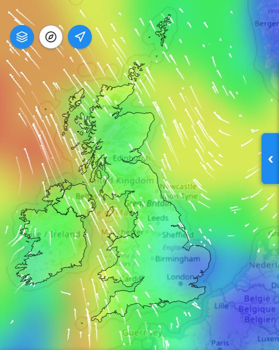
Wind
The wind page shows a heatmap of wind speeds across the entire UK and Ireland mountain coverage area. Blues and greens indicate calmer conditions; oranges and reds show where wind is picking up. Overlaid on top are wind particles — small animated arrows that drift across the map in real time, following the actual wind direction at each point. You can immediately see where the isobars are tightest, where the fetch is long, and where orographic funnelling is driving localised gusts.
None of this requires meteorological training to read. Fast-moving particles, warm colours: that means it is blowing hard over there. Slow drift, cool blues: that stretch of hills is sheltered.
The time slider lets you step through every hour of the day — and you can hit play to watch the whole day animate automatically, watching a front push through or a sea breeze develop across an afternoon.
Interactive Visuals PreviewPressure, Temperature, Precipitation, Freezing Level
Each of these pages follows the same pattern: a smooth, full-coverage heatmap that you can toggle on or off, layered over a base map, with an hour-by-hour time slider. The heatmaps are generated on your device in real time using the GPU — which is why scrubbing through hours feels instant rather than waiting for images to load. That responsiveness matters when you are trying to build a mental picture of how conditions will evolve.
The freezing level page is one we are particularly pleased with. It shows, as a gradient, where the zero-degree isotherm sits across the landscape at any given hour. On a winter day you can watch the freezing level descend as an Atlantic system approaches, and see which ridgelines will cross into icing conditions and when. No other consumer app shows you this as a spatial picture.
Interactive Visuals PreviewCloud Cover
The cloud page breaks cover down into valley, low, mid, and high layers — because those four things feel completely different when you are out on the hill. A solid base of low cloud sitting in the valley while the ridge stays clear is a very different day from high cloud thinning to give a hazy blue sky. The atmospheric cross-section chart at the left of the screen shows the profile of cloud at each level as a filled graph, updating live as you move the time slider. Alongside it, five toggle buttons let you isolate whichever layer you are most interested in.
Interactive Visuals PreviewSun and UV
On the sunny days you are most likely to be out for a long stretch, UV exposure on open ridgelines can reach levels that most people do not expect. The sun and UV page shows irradiance across the terrain, helping you understand where and when the risk is highest — something no general weather app addresses for mountain users at all.
The Terrain View: Something Genuinely New
Arguably the most distinctive thing in the new suite is the terrain wind view on the individual mountain pages.
When you navigate to a specific mountain — Ben Nevis, Scafell Pike, Yr Wyddfa — you do not just get a point forecast. You get a three-dimensional isometric rendering of the actual terrain around that summit, with the forecast wind data drawn directly on top of it. Wind particles flow across the landscape following the modelled wind field, speeding up over exposed ridges and slowing in sheltered corries. The summit is highlighted, and a stats bar at the top gives you the mean wind, gusts, and a variability indicator — whether the wind is likely to be steady or gusty and unpredictable.
Below the terrain chart sits a timeline showing how wind variability changes across the full 24 hours. This is the sigma chart — essentially a measure of how consistent the wind speed is expected to be. A low, flat line means steady conditions. A spiky, elevated line means the wind is going to be all over the place: hard gusts followed by lulls, the kind of conditions that catch you off-balance on an exposed arête.
The point of all this is to give you something you cannot get from a number in a table. A wind speed of 40mph on a steady, laminar flow is manageable. The same speed in highly variable, gusty conditions on a narrow ridge is a different proposition entirely. The visualisation is designed to communicate that difference at a glance.
Interactive Visuals PreviewWhy This Is Hard to Do Well
A word on the technical side — not to show off, but because it explains why most apps do not do this.
Rendering a smooth, interactive heatmap that updates as you drag a time slider, across thousands of data points, on a mobile device, without lag, is genuinely difficult. A naive approach — redrawing everything on the CPU every time the slider moves — produces a choppy, unresponsive experience that feels broken. We solved this by doing the calculation on the graphics chip (GPU) instead: the same technology that renders video games in real time. The result is that the visualisations feel fluid and immediate even on mid-range devices, because the heavy lifting is happening in hardware designed for exactly this kind of parallel computation.
The terrain rendering is similarly non-trivial. The isometric 3D view of the mountain is built from real elevation data, projected and shaded to give a sense of the actual shape of the terrain. The wind particles are a physics simulation running in real time, not pre-baked animations. Getting this to look natural — to feel like wind actually flowing over a landscape — required a fair amount of experimentation.
We mention this not to make the technology the story, but because the technology enables something that would otherwise be impossible: a genuinely interactive, data-driven picture of the mountain environment that updates in real time as you explore different hours and conditions.
The Bigger Picture
General weather apps are built for scale. They serve tens of millions of users checking whether to take an umbrella, and they do that job extremely well. We are not trying to replace them.
What we are trying to do is serve the hillwalker who is standing in the kitchen at 6am, trying to decide whether the ridge will be in cloud, what the wind will be doing on the summit at midday, and whether the conditions are going to deteriorate before they get back down. That decision deserves better graphics than a coloured icon and a number.
The new visualisation suite is our answer to that. It is built on the same data that underpins our summit forecasts, rendered in a way that we think is genuinely more useful for mountain decisions than anything else currently available on a phone.
We are continuing to develop it — more mountains, more layers, more ways to read the terrain. If you have thoughts on what you would find useful, we would love to hear from you.
Interactive Visuals Preview